- Stronger Customer Relationships
- +1-949-878-7411
- ramana@varasi.com
Going Beyond Standard Reports in Salesforce For Advanced Analysis
Salesforce is a great platform to manage your customer relationships. It provides a lot of data and tools to get a 360° view of your customer. Using the platform in the right way to extract relevant insights is key to meeting your business needs and improving adoption. Salesforce provides multiple ways to display information visually. For example, Charts are a great way to showcase any information effectively. In this article, we want to bring out the different ways in which you can leverage the platform to meet your charting needs.
Report Charts
The easiest way to show a single snippet of information pertaining to a record visually is by using a report chart on its record page. Report charts can be embedded on a record page or a home page. The record page report chart can also be filtered based on the record’s id to show only the data for that record.
Dashboards
Salesforce Dashboards are a powerful tool to combine related information and present it visually on a single page. Salesforce dashboards can display data from Salesforce reports using various charts like bar charts, stacked bar charts, line charts, doughnut charts, funnel charts and scatter charts. You can embed a Salesforce dashboard on a lightning record page or a homepage.
Custom visualization using Lightning Web Components (LWC)
Below are some scenarios when you may go beyond the standard reports and dashboards and leverage LWC:
- If the data to be visualized cannot be aggregated using a report in Salesforce. The data could be too granular or the required filters/aggregations may not be needed beyond the report’s use case. In such a case, it will be impractical to set up additional processes to aggregate data further on a regular basis just to display it in one chart.
- You may want some custom way of visualizing information which is not supported in the standard Salesforce dashboard charts. For example, you may want to match the look and feel of the rest of the experience cloud site with some custom visualizations.
- If using a report chart in the experience cloud, the filter will need to be based on the logged-in user’s record. But the chart you want to show may need filtering at some other level (e.g. account or other custom filter).
In such cases, showing the data visually to internal or external audiences can be achieved using a custom Lightning Web Component which uses Chart.js. Chart.js is a free, open-source JavaScript library for data visualization available under MIT license. There are 2 approaches to using the Chart.js library in Salesforce.
LWC Approach 1 (simple):
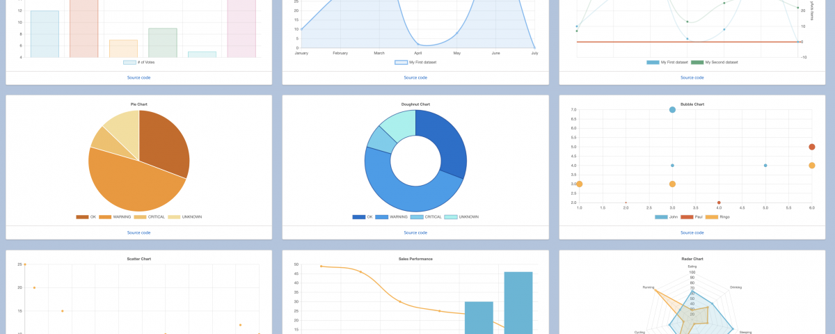
A straightforward approach is to install the Chart.js LWC component provided by Salesforce Labs on the AppExchange. Chart.js provides an LWC component which is simple and configurable as per your charting requirements. Data can be filtered as per your custom needs and passed on to this LWC. Chart display parameters can be configured in this LWC without writing any code. Parameters like the Legend, Title, Data, and Color can be configured in the LWC HTML.
LWC Approach 2 (advanced):
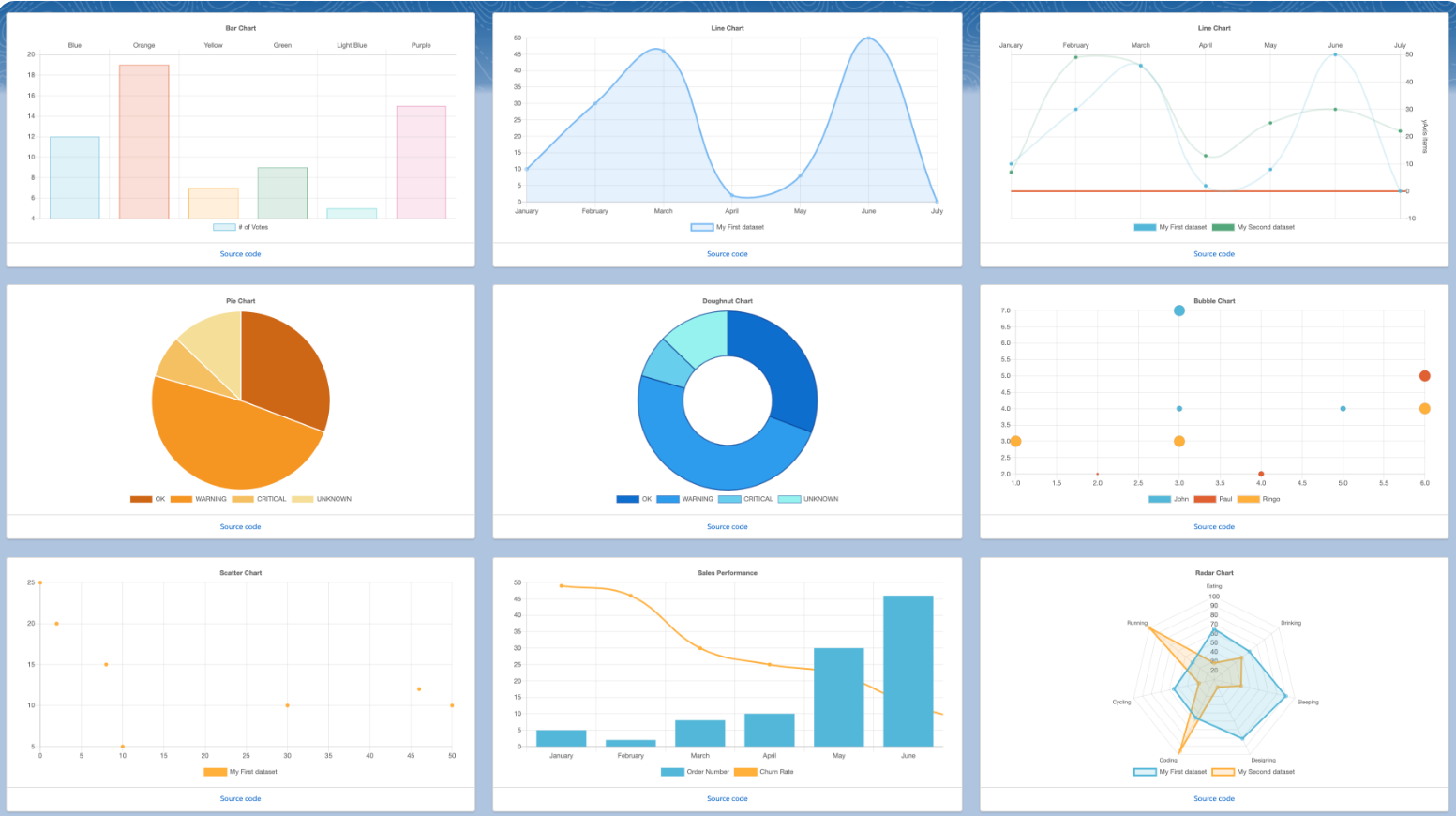
The AppExchange LWC provides a simple configuration. But without writing code, you can only configure a limited number of parameters. If you need more control on the displayed chart, you can tweak the parameters in the LWC code. The Lighting Web Chart.js Component (LWCC) from Salesforce Labs itself is available as an open-source component under an MIT license. You can review and download the code available on GitHub. It includes the relevant Chart.js libraries as well. After downloading the component, you can directly make changes as needed in the specific chart components.
Salesforce CRM Analytics
If you need to have a self-serve tool to analyze and visualize large amounts of data while including AI-powered insights then Salesforce CRM Analytics will help you achieve that goal. CRM Analytics, available for purchase as a separate offering, is a self-service application that gives immediate access to powerful data insights through its intuitive point-and-click visual interface. You can create aggregated views of your disparate data—Salesforce or external data—and then slice and dice the data to get insights.
There are various approaches to displaying information visually in Salesforce as seen above. From simple configuration to custom coding. Salesforce platform provides options to utilize various options as per need and deliver a compelling user experience. Match your solution to the business needs with user experience and adoption in mind.
Team Varasi


