- Stronger Customer Relationships
- +1-949-878-7411
- ramana@varasi.com
How to Display Custom Data Type in Salesforce lightning-data table?
Lightning data table is a powerful component in Salesforce to display tabular information. A lightning-data table component displays tabular data where each column can be formatted based on the data type of the underlying data. It supports many standard Salesforce data types like String, Date, Number, and Currency. But you can do much more with the data table. You may want to display some information that goes beyond the standard data types and associated formatting e.g. an image or a button. That is where the custom data type feature of the Lightning Web Components (LWC) data table comes in handy.
Custom data types let you implement a custom cell, such as a delete row button an image, or even a lightning web component. This enables you to develop intuitive and immersive user experiences for business users. In the example below, we will see how we can embed a lightning web component into a column of an LWC data table.
Adding a lightning web component to a data table
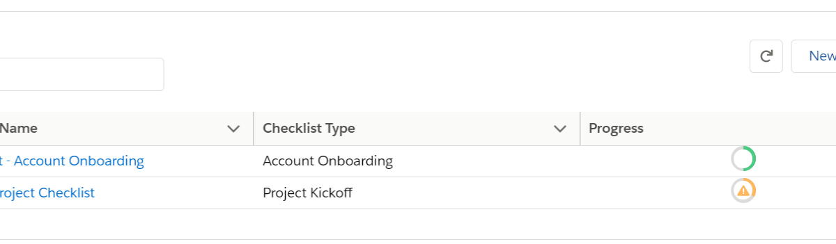
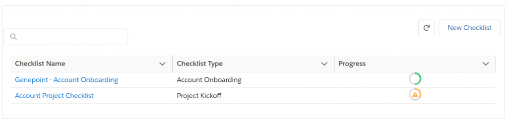
In this example, we take a scenario where you want to show visual progress within a column. We are using a progress ring component to show the completion progress of a checklist.
Step 1
Create a custom LWC component that extends the lightning data table. This is where we define our custom datatype for the progress ring.
New LWC component: customDatatableComp
Leave its HTML blank
The custom component’s Javascript is where we will define our custom datatype
customDatatableComp.js:
import LightningDatatable from ‘lightning/data table;
import progressRing from ‘./progressRing.html’;
export default class customDatatableComp extends LightningDatatable {
static custom types = {
proving: {
template: progressRing
}
};
}
You may have noticed a reference to progressRing.html which is explained in Step 2.
Step 2
Create an HTML in the same folder as the LWC and name it progressRing.html. This HTML will hold our custom datatype format, in this case, it will be just a standard lightning progress ring component
progressRing.html:
<template>
<lightning-progress-ring value={value} size=”large”></lightning-progress-ring>
</template>
Step 3
Use the custom data table component created in step 1 in your component. In your component HTML, refer to the custom data table below
<c-custom-datatable-comp data={data} columns={cols} </c-custom-datatable-comp>
In your component Javascript, set the custom datatype in the appropriate column.
cols = [
{label: “Checklist Name”,fieldName: “Name”},
{label: “Checklist Type”,fieldName: “Checklist_Type__c”},
{label: “Health Indicator”, fieldName: “avgHealthScore”, type: “proRing”}
];
In 3 easy steps, you have seen how you can extend the data table to show visual elements.
Team Varasi
References:
https://developer.salesforce.com/docs/component-library/bundle/lightning-datatable/documentation


